The brief
An identity for a foundation built on knowledge.
IDIOMA Research Foundation is dedicated to advancing knowledge through research, education and innovation, while exploring the evolution of human communication, language and cultural understanding.
We created its complete visual identity: the logo, the colour and type system, stationery, and a 16-page brand book that keeps every application consistent.

The logo concept
The journey of knowledge, from curiosity to discovery.
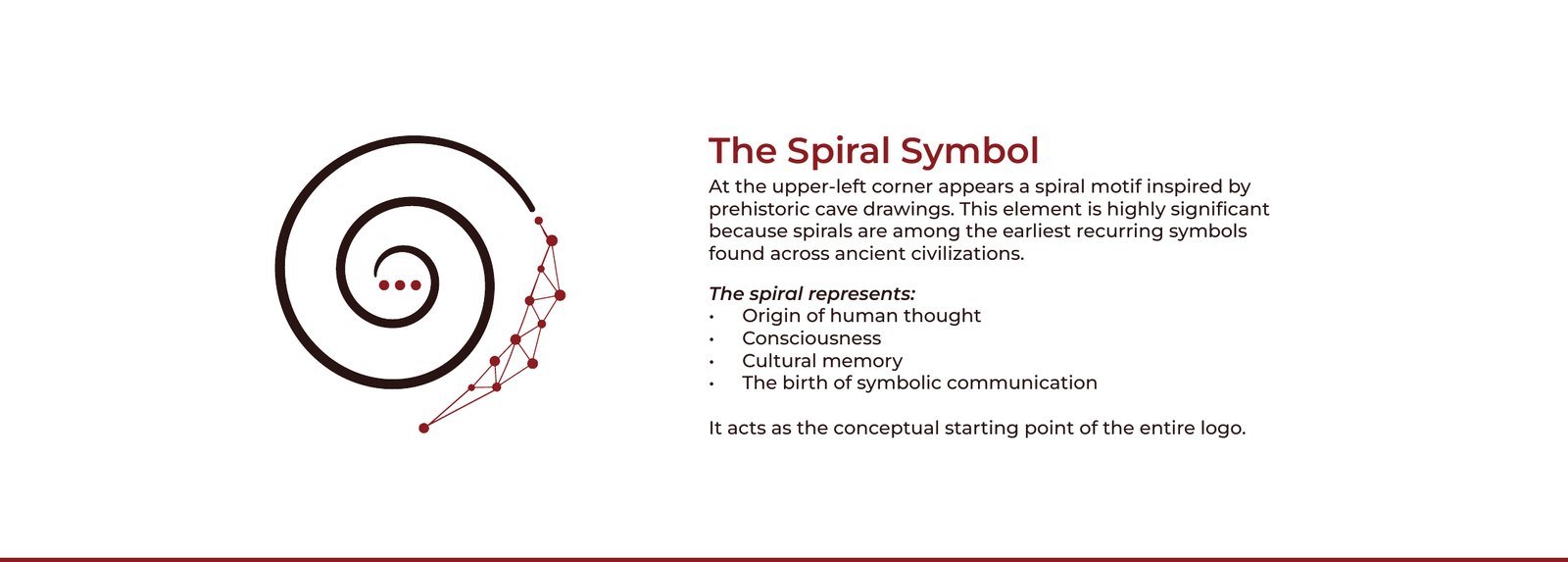
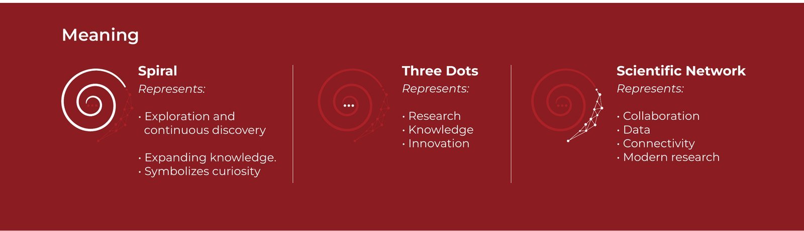
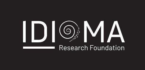
The symbolic ‘O’ at the centre of the wordmark is a spiral inspired by prehistoric cave drawings, one of the earliest recurring symbols across ancient civilisations. It stands for the origin of human thought, cultural memory and the birth of symbolic communication.
Three dots at its heart represent research, knowledge and innovation, and the scientific network around it represents collaboration, data and connected research.
The visual identity system
One set of rules for every application.
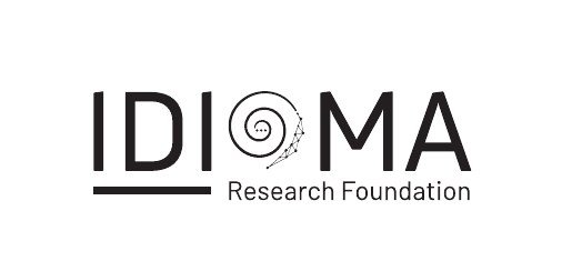
Full colour, black and white versions keep the logo clear on any background and print method.

Two colours drawn from natural cave pigments, with a refined, contemporary academic feel.
Deep Earth Red
- HEX
- RGB
- 142, 32, 32
- CMYK
- 28, 97, 95, 29
Oxide Brown
- HEX
- RGB
- 44, 16, 16
- CMYK
- 54, 77, 69, 79
The palette resembles
- Natural cave pigments
- Ancient rock paintings
- Iron oxide minerals used by early humans
It communicates
- Heritage
- Human history
- Authenticity
- Cultural preservation
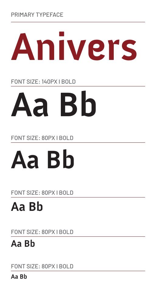
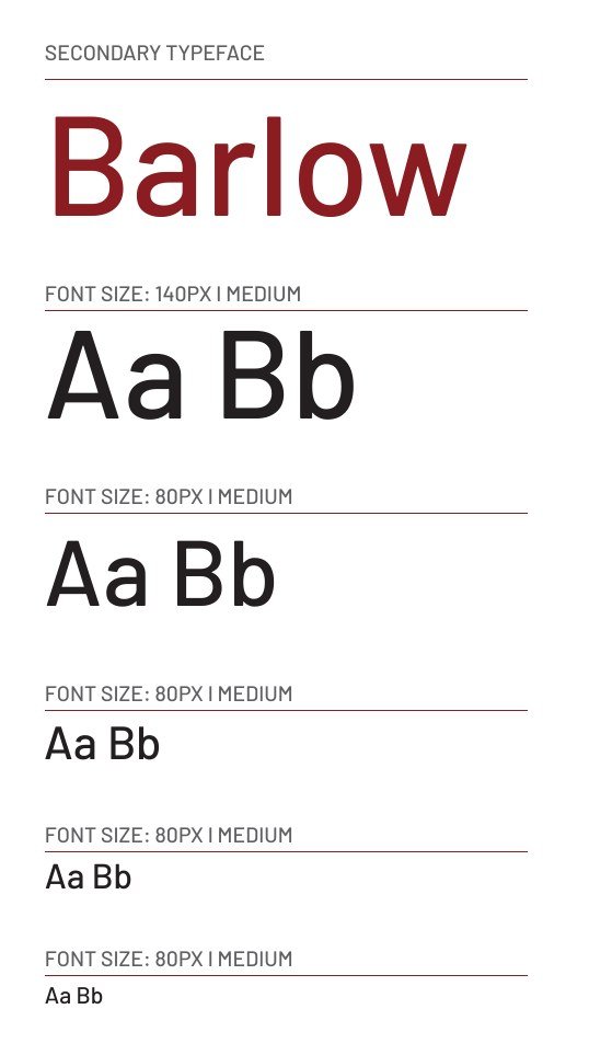
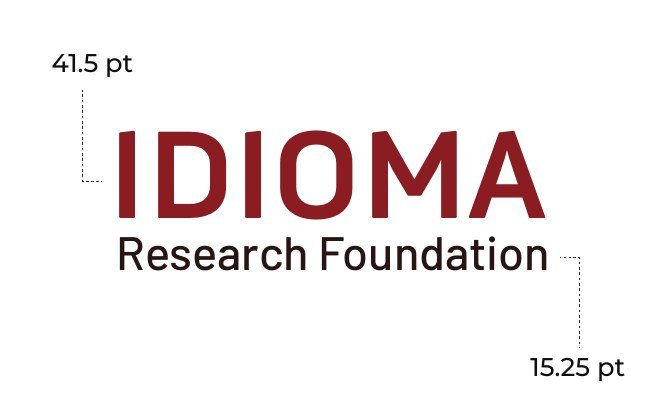
Anivers Bold leads; Barlow Medium supports. The lockup pairs IDIOMA at 41.5 pt with Research Foundation at 15.25 pt.
A clean horizontal composition, with the symbolic ‘O’ at the centre of the wordmark.
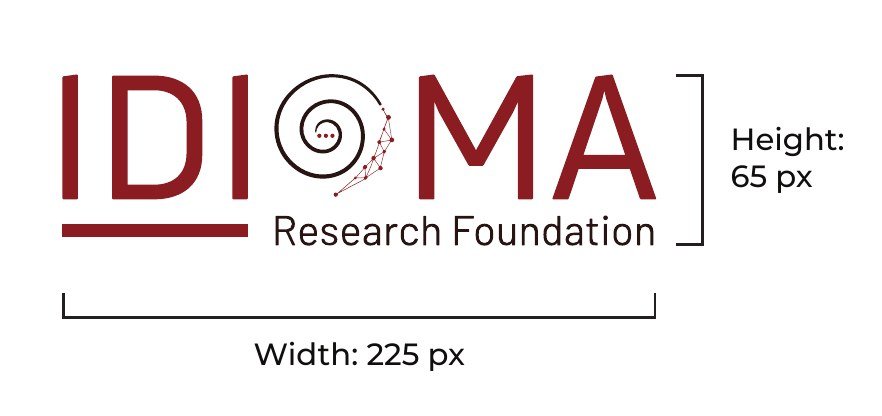
- Proportions: 225 px wide by 65 px high
- Brand name: modern, credible and recognisable
- Organisation type: defines the academic and research focus
- Spiral symbol: curiosity, knowledge and scientific innovation

A protected area keeps the logo prominent and never crowded.
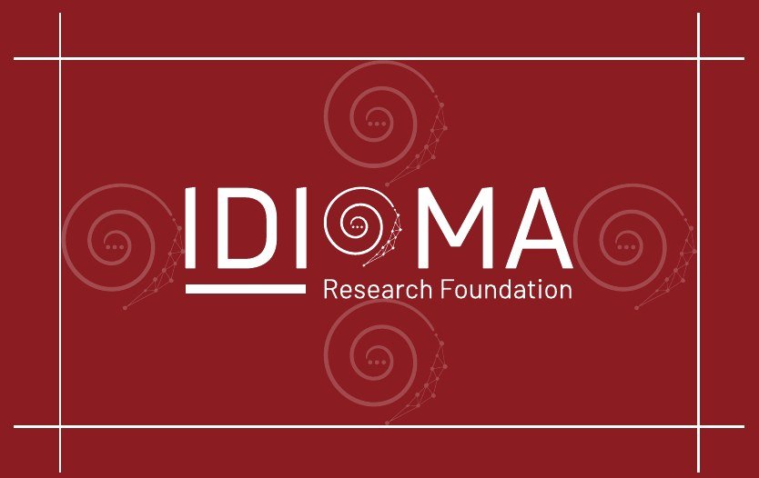
- Minimum clear space equals the innermost circle of the symbolic ‘O’ (X)
- No text, graphics, images or borders inside this area
- The clear space scales with the logo
- Always use the original artwork
Nine alterations that are never allowed.









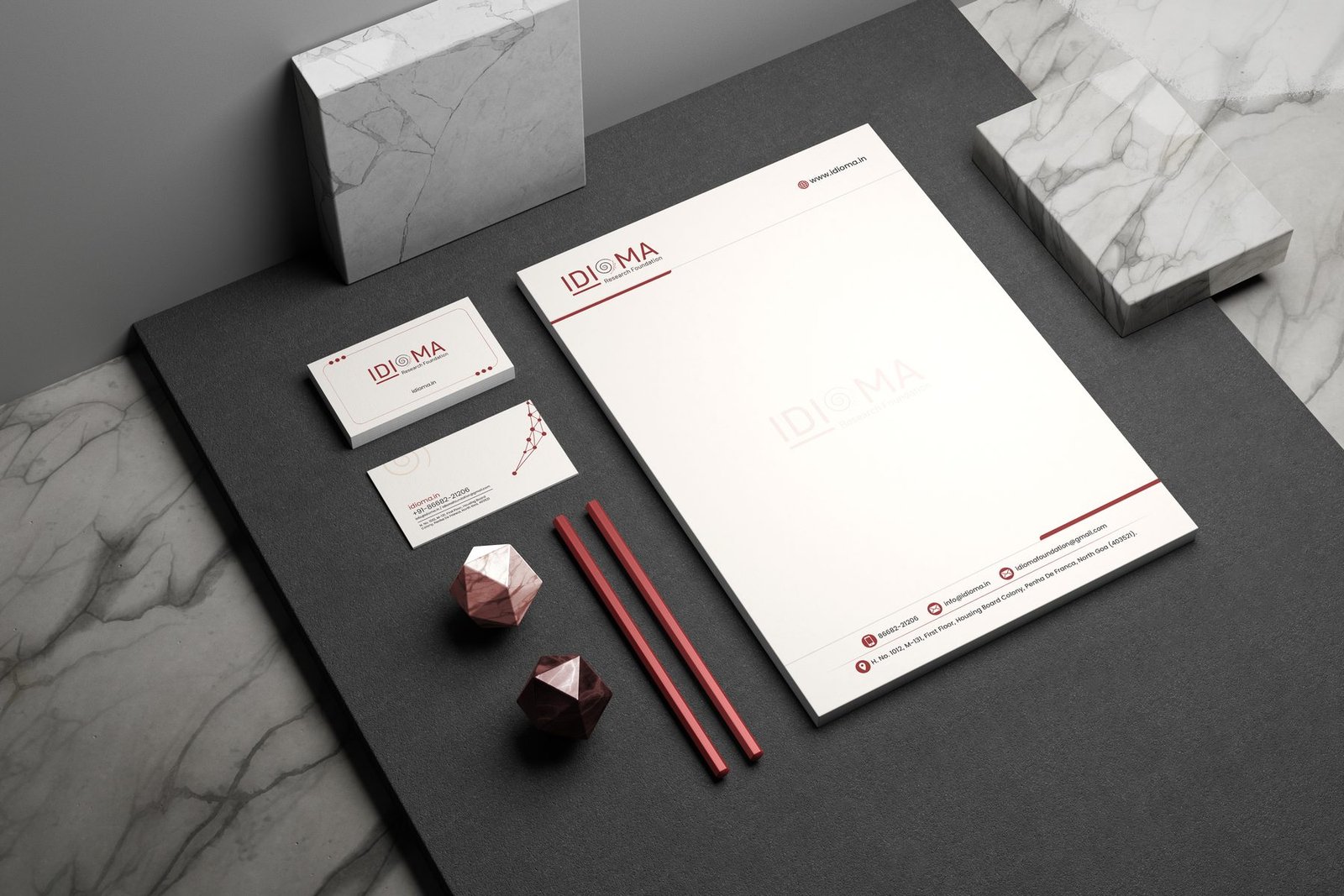
Stationery and applications
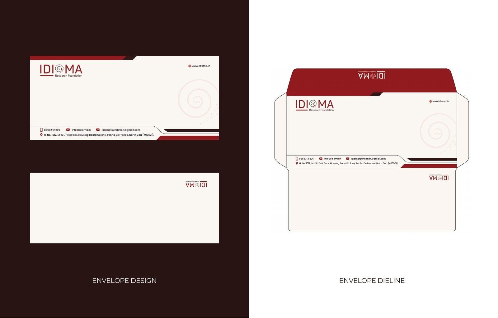
Letterhead, business card and envelope, ready for print.
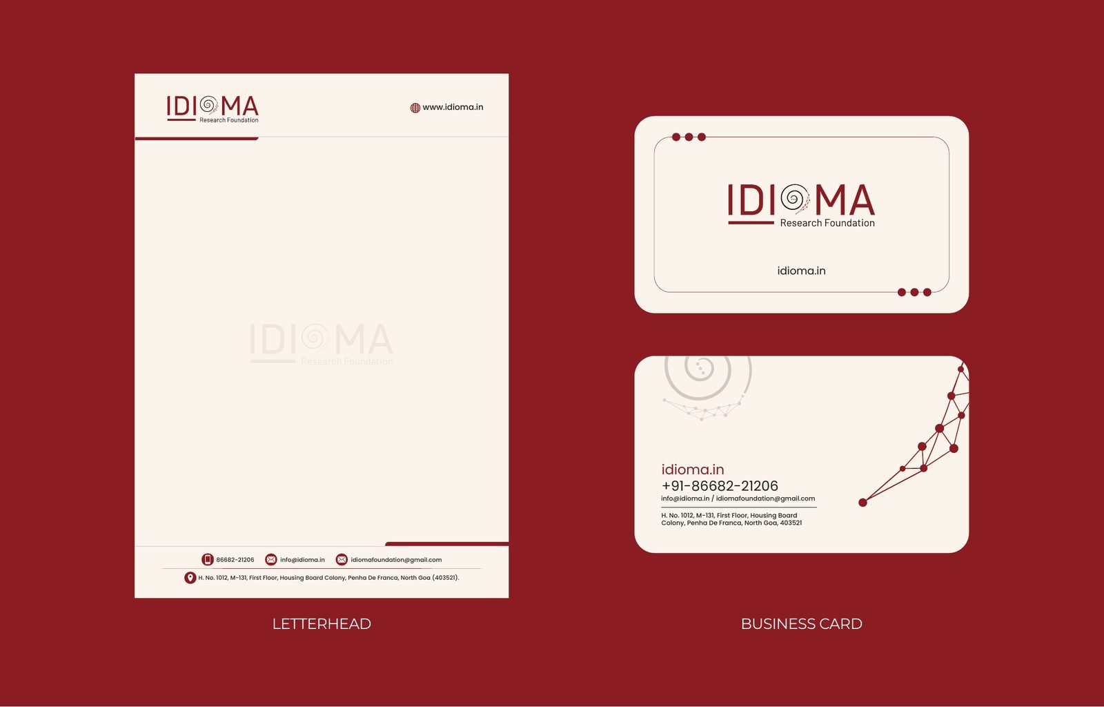
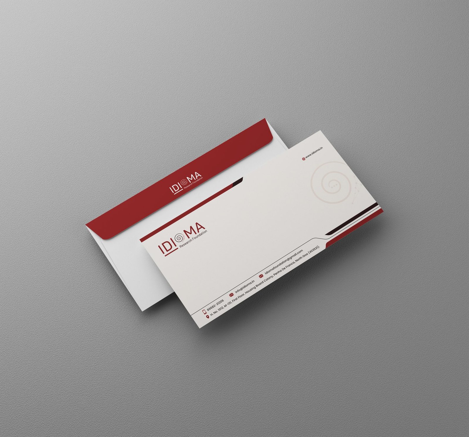
Explore the IDIOMA Brand Book
Explore the visual identity system, design rationale and brand guidelines developed for IDIOMA Research Foundation.
What we delivered
A complete, documented identity.
The full system is documented in a 16-page brand book, so designers, printers and the foundation's own team can apply the identity correctly across print and digital media.
Everything we delivered
Identity
- Logo design
- Black and white logo versions
- Colour palette
- Typography system
Guidelines
- Logo construction and proportions
- Clear-space rules
- Incorrect-use examples
- 16-page brand book
Stationery
- Letterhead
- Business card
- Envelope and dieline